Again, the branding side of it is interesting, as long as businesses, etc, are prepared to get involved.
I like the idea of tacking the angle/shape and door onto the bottom of posters/advertising/photos, etc.
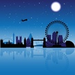
The actual physical red door at the airport/landmarks sounds clever too.
I'm on board, I think it could be great.
New SA Logo

Re: New SA Logo
Thumbs up from me.
Love the video, and I agree with Rev about uses of the logo - it will work. I must admit I prefer the photo version, with the jumping roos, to the red one, but that's just me. And the large SOUTH leaves no question about who we are or where we are. All good.


Love the video, and I agree with Rev about uses of the logo - it will work. I must admit I prefer the photo version, with the jumping roos, to the red one, but that's just me. And the large SOUTH leaves no question about who we are or where we are. All good.
cheers,
Rhino
Rhino
Re: New SA Logo
You can see this is aimed internationally, and for that reason it will be a great long term success.
I watched that video again and it's grown on me, though they should of used nicer footage of the southern beaches. This summer our beaches have been looking beautifully pristine and clear.
I watched that video again and it's grown on me, though they should of used nicer footage of the southern beaches. This summer our beaches have been looking beautifully pristine and clear.
Last edited by crawf on Thu Mar 07, 2013 12:20 pm, edited 1 time in total.
Re: New SA Logo
Having put a little more thought into my comment above, the logo with the photos of the roos looks great large, but would be useless small. Conversely, the red logo is great small, but not so good large.rhino wrote:Thumbs up from me.
Love the video, and I agree with Rev about uses of the logo - it will work. I must admit I prefer the photo version, with the jumping roos, to the red one, but that's just me. And the large SOUTH leaves no question about who we are or where we are. All good.
cheers,
Rhino
Rhino
Re: New SA Logo
It is absolutely terrible. I hate it. So cringeworthy. I could have come up with something better than that!
The red is far too overpowering. It's a bold colour, but it doesn't do the state justice. Red to me is synonymous with 'stop', Canada, Communism, the outbank - a land of desert and nothing else.
The 'doorway' is just idiotic - more people leave this state than they do coming into it! Last one to leave, make sure you turn the lights out!
The biggest failing is including the outline of Australia with the cut-out of South Australia. We are trying to sell South Australia - not South Australia as part of Australia.
I could just go on and on.
0/10.
Any views and opinions expressed are of my own, and do not reflect the views or opinions of any organisation of which I have an affiliation with.
-
Nathan
- Super Size Scraper Poster!
- Posts: 3770
- Joined: Tue Feb 03, 2009 1:09 pm
- Location: Bowden
- Contact:
Re: New SA Logo
I've got quite a bit of flying to do tomorrow, but thought I'd weigh in a brief comment. The brand is disappointing, full stop. Primarily, I think the problem was the brief. It doesn't seem to have ever progressed past the "where is South Australia" comment that the premier encounted that sparked this whole thing. Exact location is not important. Ask most people to place major cities or regions on an unlabelled map and they'd struggle (New York is probably the only exception). What matters is what the state represents and offers, and the process to arrive at this brand doesn't seem to have ever gone there. Aside from that, the execution is very average. It's badly drawn, and a glimpse at the brand book immediately shows inconsistencies. It is not the kind of work I expect of Cato and I suspect much of it was farmed out.
I don't like to openly criticise work like this, especially before it's had time to settle. It's not good for the client, and it's not good for our (graphic design) industry. But unfortunately there are some obvious failings that can't go without mention. Cato is better than better than this, our local design industry is better than this, and SA is better than this. There's a strong stench of design by committee here.
I don't like to openly criticise work like this, especially before it's had time to settle. It's not good for the client, and it's not good for our (graphic design) industry. But unfortunately there are some obvious failings that can't go without mention. Cato is better than better than this, our local design industry is better than this, and SA is better than this. There's a strong stench of design by committee here.
Re: New SA Logo
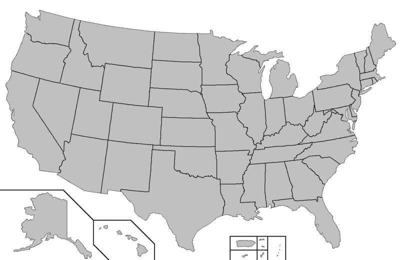
Chicago is a city with an urban population of 8.7 million people. Where is it located on this map?
-
monotonehell

- VIP Member

- Posts: 5466
- Joined: Fri Feb 01, 2008 12:10 am
- Location: Adelaide, East End.
- Contact:
Re: New SA Logo
Embarrassingly my guess put it above Milwaukee.dsriggs wrote: Chicago is a city with an urban population of 8.7 million people. Where is it located on this map?
In slightly tangential, but coincidental news; Nick "Pogo" Bertke has released two videos of the Ghan and Indian-Pacific. I'm guessing he was commissioned by Great Southern Rails. I think these are a better and more interesting postcard from all the locations along the way than the jumble released last night.
Also I can see my house in one of them.
Nick's from Perth and made himself popular remixing cut up Disney movies amongst other things.
Exit on the right in the direction of travel.
Re: New SA Logo
As an expat living in the UK, every time I mention I'm from Adelaide, the first thing I'm asked is "where in Australia is that?" or "where is that in relation to Sydney/Melbourne/Perth?" (Perth actually comes up frequently - everyone over here has heard of Perth, which I found strange.)
In terms of putting SA "on the map", so to speak, or answering the same question I'm asked constantly, it serves the intended purpose.
Whether its attractive or will prove to be effective from a business sense is another question.
Not surprised everyone on AdelaideNow has slagged it off - lets face it, "the money could have been better spent on hospitals" (ugh), but by the comparison earlier in this thread to other state brands, it's certainly one of the better ones.
Re: New SA Logo
All day I've had that god damn song 'South' stuck in my head. It's extremely catchy!
Re: New SA Logo
That's easy, for me, but as my wife told me yesterday, "there is no reason to know that". Maybe not. What can I say - I'm a cartographer, I know where places are. I could never understand why other people don't. Having said that, I have not the slightest clue how an internal combustion engine works.dsriggs wrote:[img]Chicago is a city with an urban population of 8.7 million people. Where is it located on this map?
However - it was a good task dsriggs. I think if you wanted something maufactured, and a company from Chicago put in a good tender, you would want to know where Chicago is to see how it's location will affect your distribution. If you don't know where it is, but you do know where another city is where another good tender came from, the Chicago firm might just miss out on your job, mightn't they?
Or, if you are holidaying to the USA and a friend tells you Chicago is worth a look, you will want to have an idea of where it is to fit it into your itinery. If you don't know where it is, you might just decide to stick to the places you know the location of ("Is Chicago in the Midwest? That's where I was! I always thought Chicago was down near Mexico! Damn, I should have gone there!")
cheers,
Rhino
Rhino
Re: New SA Logo
There's a competition going on on a crowdsourcing site to come up with a better logo:
http://99designs.com.au/logo-design/con ... 33/entries
Some good ones, but there's a LOT of garbage there...
http://99designs.com.au/logo-design/con ... 33/entries
Some good ones, but there's a LOT of garbage there...

-
Maximus

- Legendary Member!
- Posts: 630
- Joined: Wed Feb 20, 2008 12:05 pm
- Location: The Bush Capital (Canberra)
Re: New SA Logo
Argh. First I was underwhelmed by the new logo, then it grew on me, and then I started feeling negative about it again. Now I'm feeling even more negative -- there are some very impressive entries to that comp. Plenty of junk, yes, but some of it looks seriously good. Certainly much nicer than what we've been given.dsriggs wrote:There's a competition going on on a crowdsourcing site to come up with a better logo:
http://99designs.com.au/logo-design/con ... 33/entries
Some good ones, but there's a LOT of garbage there...
As for the Tassie outrage... Seriously? It's not like you were deliberately snubbed. Showing an island clearly doesn't work for graphic design purposes. Should we have also included Christmas Island in the logo...?!
It's = it is; its = everything else.
You're = you are; your = belongs to.
Than = comparative ("bigger than"); then = next.
You're = you are; your = belongs to.
Than = comparative ("bigger than"); then = next.
Re: New SA Logo
83 logos in there, when I looked, and only 5 of them showed South Australia's location within the rest of Australia, which was what the brief was, as far as I'm aware.
Of those 5, I prefer what we've ended up with, especially if it is not always red, but if "Australia" is an iconic photo. Red is fine for a small logo at the bottom of an A4 magazine page.
Of those 5, I prefer what we've ended up with, especially if it is not always red, but if "Australia" is an iconic photo. Red is fine for a small logo at the bottom of an A4 magazine page.
cheers,
Rhino
Rhino
Who is online
Users browsing this forum: Bing [Bot] and 105 guests