Page 13 of 17
[COM]
Posted: Wed Jan 17, 2007 1:16 pm
by UrbanSG
I was worried about what was going to happen on the western side with the steel frames in place in past photos. Wondering what the attachments were going to be. Sounds terrible. A feature like that can wreck a whole building imo. Plus this tower should have been taller and not so darn wide, it is a world headquaters, you wouldn't know it!
[COM]
Posted: Fri Feb 02, 2007 1:40 pm
by Snorkie
I was speaking to a friend today who works for Santos and she told me that Santos is going to move into their new building in mid April. Just out of curiosity does anyone know when westpac will move into the santos building, and furthermore, when will the naming rights change?
[COM]
Posted: Fri Feb 02, 2007 3:04 pm
by Ben
1st July 2007
[COM]
Posted: Sun Feb 04, 2007 12:38 am
by AtD
I hate this building more each time I see it. I think it's rather ugly, especially from the north and east. The window box thing looks strange because it doesn't match the rest of the building (different glass). I also don't like the red lines.
From the south west, the building's best angle IMO.


The actual 'Flinders link' laneway.

Eastern face

Northern 'face'

From the North west

[COM]
Posted: Sun Feb 04, 2007 2:02 pm
by Mants
i must say i think i prefer IAG over Santos...and that's saying something
[COM]
Posted: Sun Feb 04, 2007 11:47 pm
by crawf
likewise
[COM]
Posted: Tue Feb 06, 2007 12:31 am
by Ho Really
AtD wrote:From the North west
Adam, in this image I don't know if you can see it, but one of the precast panels is not mounted flush and sits on a slight angle. I noticed it a week or so ago while driving down Pirie Street. It's the third dark-grey panel from the top (second from right adjacent lighter panel).
Cheers
[COM]
Posted: Tue Feb 06, 2007 11:53 am
by AtD
I can't see it. Could you highlight it with an image editor?
[COM]
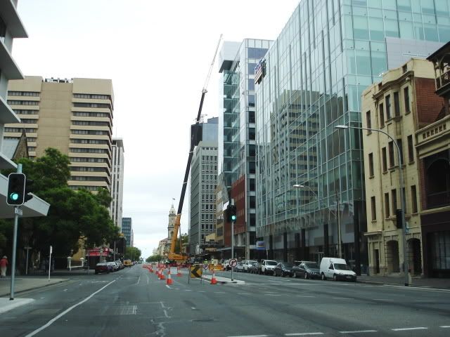
Posted: Sun Feb 11, 2007 10:53 am
by UrbanSG
This development really is terrible considering it involves a 'world headquarters'. I couldn't even bare to photograph the western side, YUK!!! This is the best angle imo and it isn't that flash. From today:
[COM]
Posted: Sun Feb 11, 2007 12:01 pm
by Pistol
I think the further you get away from Flinders Link the better it looks

.
[COM]
Posted: Tue Feb 13, 2007 11:15 pm
by Ho Really
As world headquarters, yes, it should have been impressive. A taller building (by a few more floors) would have been better. I think the original design was a winner.
Cheers
[COM]
Posted: Sat Feb 24, 2007 11:30 am
by Pikey
Once both towers have has a bit of spit & polish, they don't look too bad.


IAG still looks better though
[COM]
Posted: Sat Feb 24, 2007 1:06 pm
by AtD
I agree, IAG looks better. Your shots captured how ugly those red bars on Santos are, they're shocking.
[COM]
Posted: Sat Feb 24, 2007 2:45 pm
by aussie2000
what is the piont of those stupid red bars on santos, the have no meaning other than making that whole area ugly
[COM]
Posted: Sat Feb 24, 2007 8:24 pm
by how_good_is_he
The ochre colour of those bars was an attempt by the architect to symbolize the colour of his arse after he has been sitting on it all day during this boring project!